How to write the best pitch deck?

Pitch decks are all very different. They are customized for the fundraising round, the industry, the country, the experience of the entrepreneurs.
This is the pitch deck, slide by slide, 9 slides long, to unite us all! [If you don’t care about the explanations, here is the link for the deck. Feel free to use it for your fundraising!] Please note, this is a brief pitch deck, the one you send to test waters. For example, there are a few slides which are a combination of traditionally separate slides.
Before we start, here are the basics:
- Presentation in Google Slides, Powerpoint, Canva (not in Word!)
- Ideally, in english (🇺🇸/🇬🇧).
- Give the investor enough information to be interested but not too much that he may find an excuse to not invite you over for coffee.
- When finished, send the pdf! (Please never send the pptx, it’s not professional).
First Page:

This first slide is pretty straightforward. Your logo on top and at the bottom the reason for the presentation (Seed Deck, Series A Deck, Investment Presentation, etc…) and then the date.
The date is useful for you and the investors you meet. If you meet the investors multiple times over the year, it will be easy for them to see how your numbers have evolved and how (hopefully) you’ve beaten your projections!
Second Page:

The second page should be the pain point you are trying to solve in one short sentence. Your pain point must be understandable and excitable at the same time. If you were Facebook, the pain point in 2004 was something along the lines of: How do you stay in touch with friends?
If you haven’t figured it the pain point you are solving, it’s that your startup is not ready (will not find clients) or that you haven’t thought of monetization either.
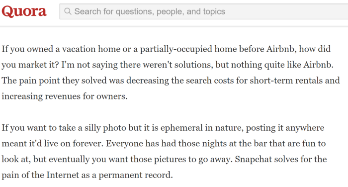
To help you brainstorm, below are the paint points of Airbnb 🛌 and Snapchat 👻 as examples:
Third Page:
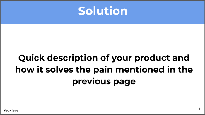
The third page is the answer to the previous slide, and how your work solves the pain point and the problems it generates. In one sentence, describe your product. You can include a picture, a screenshot. This should be a light slide and invite the conversation to talk about your startup.
A lot of startups tell us that their product is quick and great, but your solution must have a distinguishing characteristic from all other startups, or what we like to call a zone of genius. What is the specific advantage? (and it’s not price, better UI/UX, or a faster product). It’s tech, data, or something defendable.
As example, below is the “solution” from Front Series A deck.
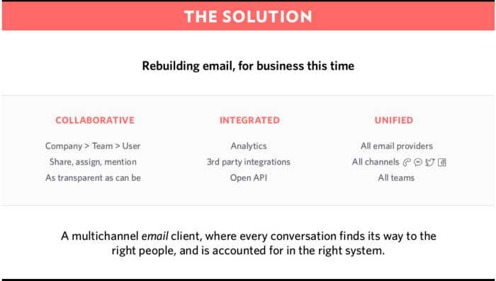
The mission at the top, three adjectives of the service, then a brief description of the product at the bottom. Perfect slide.
Fourth Page:
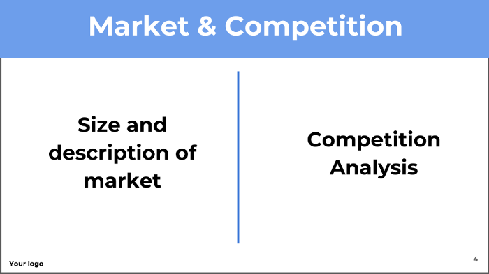
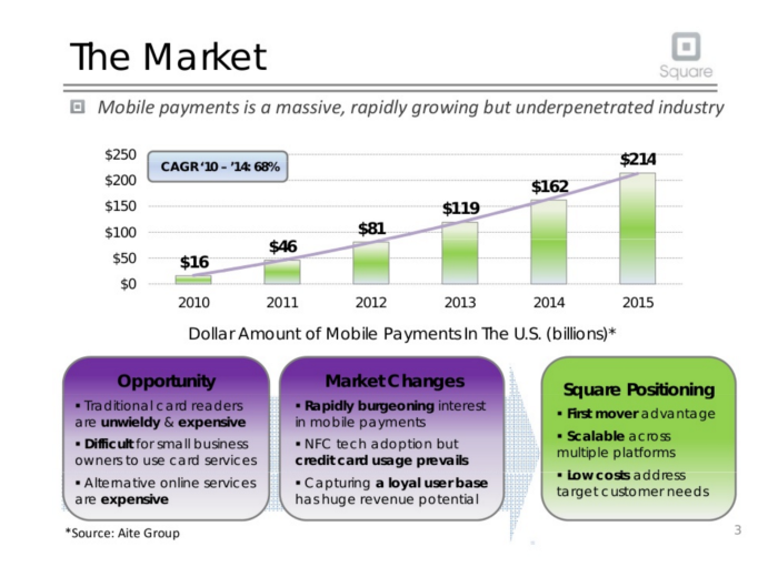
Give a few data points as to the size of your market. Make some smart estimates that will show the investor you have thought through your business potential (bottoms up analysis preferred!).
The market does not necessarily need to be enormous but if the national potential is less than $100 million (in a European country alone or the US), it probably is too small for a VC investor.
For inspiration, below is Square initial fundraising market slide:
Fifth Page:
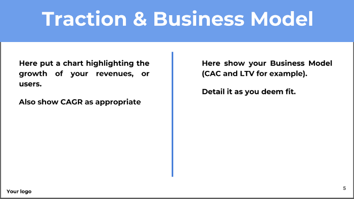
This page is crucial. On the left, show growth, show monetization, show anything that an investor will relate to product market fit.
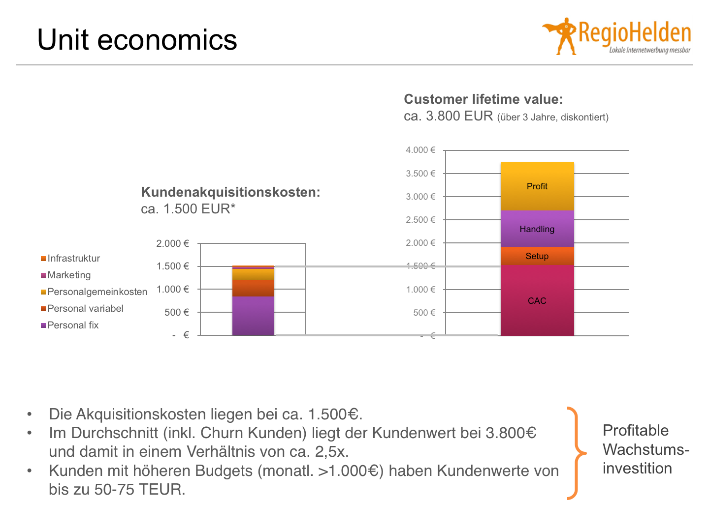
On the right, detail your business model through a mix of CAC (Customer Acquisition Cost) and LTV (Lifetime Value). If you are not a software or marketplace, talk about more relevant metrics like your sales process. How do you get your clients, what’s the sales funnel, who handles it, its conversion rate, how much does it cost per client?
Below is an example from Feliks Eyser’s complete deck he used to raise €10M:
Sixth Page:
[If your revenues do not include a recurring component, skip this page.]
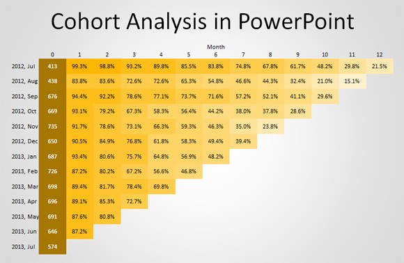
If your revenues include a recurring component, make sure you include a slide with cohorts. If you do not know how to build cohorts, use ChartMogul or read this article.
Often cohorts are enough to drive the conversation as analyzing them should make the investors ask more insightful questions about the business.
Your cohort should look like this:
Seventh Page:
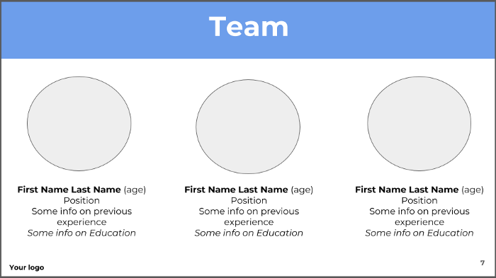
The team page should show the active founders and managers who own capital (no more than five people on this page). Forget the board of so-called “advisors” (🤦) or the freelancers helping from time to time. As much as you want or wish, the latter are not key to the company’s long term success until they invest money or work full-time on the project.
The slide is not here to show which prestigious schools the team has gone to, but rather how complementary it is. Make sure this slide clearly implies who does what (finance, dev, operations, etc…)
You can also add below each person how much of the capital they own.
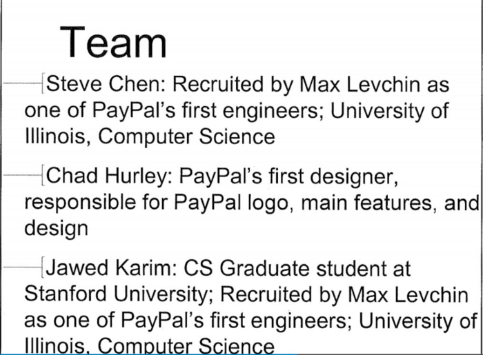
Below is Youtube’s team slide for its 2005 fundraise.
Eighth Page:
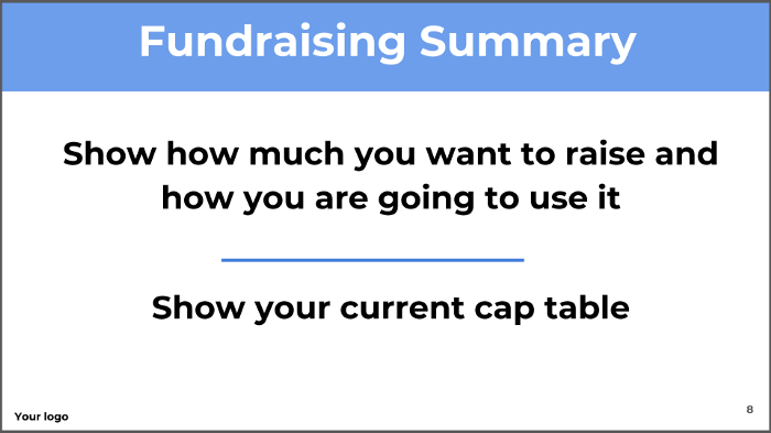
Here you should show how much you want to raise and a quick breakdown on how you plan to use the money. A seed deck should not have most of its fundraising allocated to marketing, you’re still at the product market fit. If you are in Series A, marketing makes more sense as you’re considered more into the go to market phase.
Also interesting is a cap table so the investor know how diluted the entrepreneurs are. At the seed level, ideally that number is above 85%. At the Series A, it is above 65%. Write this down if you did not include it in the previous page.
Ninth Page:
As an investor, I don’t necessarily like this page because the entrepreneur is sending me the presentation so therefore I do no need it. But it’s actually quite important for the entrepreneur. If you accept, your presentation may be forwarded to a friend, a business angel, or a fund, and someone interested might want to contact you directly. If they have that page, it’ll be much easier for them. Always include a short one!
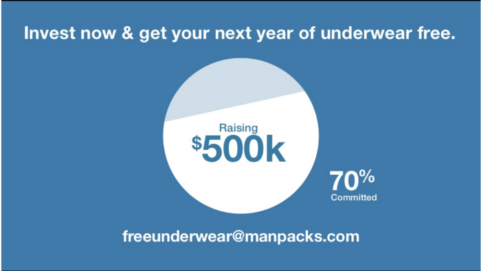
Alternatively you can put all that information on the previous slide, especially if your cap table is obvious (first fundraising). Discreetly like Manpack’s last fundraise slide below:
Now that you are done, double check it, send it, and wait for investors to answer you.
Your feedback is priceless, feel free to ping us at augustin@newfundcap.com or anne-sophie@newfundcap.com.

