Cohorts, cohorts, cohorts!

Why cohorts are your single most important assets when fundraising, and how you should showcase them to venture capital funds!
There I said it! You could have the best pitch deck in the world, but your cohorts’ slide alone could do the job to convince an investor (🔥).
In this article, we will:
1️⃣ Explain what cohorts are and how to read them,
2️⃣ Understand the two most relevant types of cohorts that exist, and
3️⃣ Share the best guides to build you own cohorts!
1. Why is the slide with your cohorts crucial?
At its most basic, a cohort analysis is the study of behaviors of groups over time. You may not have realized but you see cohorts every day, in the news, research papers, presentations.
Let’s understand the concept of cohorts with a very simple example and let’s look at the unemployment rate in the US between 1974 and 2013:
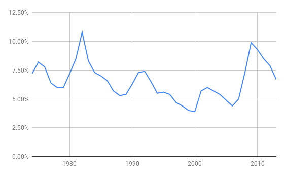
From this chart, it looks like the rate has some ups and down but has been somewhat stable. Now let’s look at cohorts for the same period:
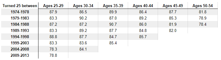
The above chart shows how the employment rate evolved during the life of different cohorts. People who turned 25 between 1974 and 1978 are cohort 1. People who turned 25 between 1979 and 1983 are cohort 2. As they aged (i.e. move from one column to the next, on the same row), their employment rate evolved.
🚨 To analyze the evolution of a precise cohort, you would read the row. Most cohorts will have a decreasing employment rate with age and you would expect the employment to drop to almost zero at the retirement age. It makes sense.
🚨 To analyze how cohorts are evolving, you would read the column. Here you can see that the most recent cohorts consistently have lower employment rate than their elders had the same age. (If you want to know why, you can read the NYT article).
You can also assess the effect of a particular event on the whole population. For instance here, you can see the effects of the 2008 economic crisis (see the cells highlighted in red):
The younger generations were more strongly affected than the older ones. For generations who turned 25 between ’94 and ’08, the employment rate increased when they moved to the next age group, post crisis. For the older crowd, it became harder to find a job post-crisis.
Now let’s switch to how cohorts can help entrepreneurs better monitor their product performance!
2. Types of Cohorts
From a tech perspective, cohorts indicate how sticky and valuable your users are becoming. It can also help you detect issues and unusual behaviors.
There are two types of cohorts that investors like to see. The first one shows users’ stickiness (Users). The second one shows product stickiness (Product).
Users
Below is a bare-bones cohorts’ analysis:
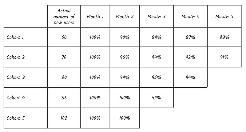
- The first column are the cohorts organized by periods (typically by month, trimester, or semesters).
- The second column are the actual numbers of users who signed up.
- The third column is the % of users active the first period. That number is always 100%. Unless you have sign-ups but people don’t even connect once to your service (Hint: your product isn’t market fit yet if that’s the case)
- The fourth column are the number of users still active divided by the number of users who originally signed up. That number could be unchanged (100%) or maybe some people have stopped using the service, hence you are experiencing churn.
- Keep doing it the same calculations for the remaining columns.
This cohorts shows if your users like the product enough to stick around. This is a first validation of whether you’re getting to product market fit. The numbers in the analysis cannot mathematically go above 100%.
⚠️ If after 6 to 12 months, less than 50% of your original users remain, you have two options: 1. Your product is not meant to be recurring (don’t show cohorts then), and/or 2. your product doesn’t solve a true pain point (😟-will be tough to fundraise).
Now let’s get onto the most interesting of all cohorts, the one that can shut down detractors of your churn!
Product
Again, below is the product bare-bones cohorts’ analysis:
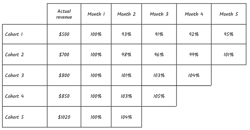
It differs from the users cohorts by the way it is calculated. As you can see, some percentages are above 100%. Wait what?
This analysis is different. The goal is to calculate how much your remaining users are spending compared to your first period. It highlights whether you are able to upsell your clients on additional products or add-ons you are commercializing.
- The first column are the cohorts organized by periods (typically by month, trimester, or semesters).
- The second column are the 1st period revenues from users who signed up. It is basically the number of users who signed up times the ARPU (average revenue per user).
- The third column are the revenues from the cohort from the first period divided by the revenues from that same cohorts at sign up. Since the first period and the sign up are the same, that number is always 100%.
- The fourth column are the revenues from the cohort from the second period divided by the revenues from that same cohorts at sign up. As users churn, that number structurally goes down. Unless, the users who remain, decide to add more accounts, or pay for product add-ons.
If your product cohorts show increasing numbers 100%+ you are experiencing Net Negative Churn. Venture Capital funds love it!
To prove you what I mean, let’s end this part with one of the best examples publicly available, a french jewel in the name of Front App. This is their product cohorts’ slide from their Series A deck:
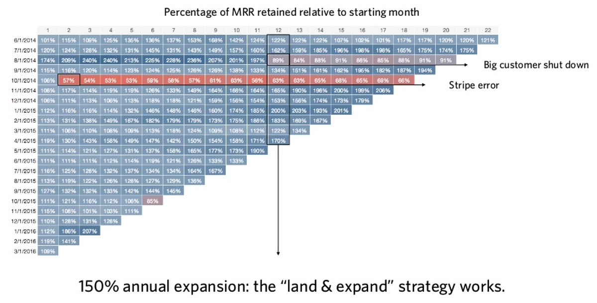
What’s amazing here, is that almost every cohort has a negative net churn. To illustrate, look at users who joined in May 2015. Just 11 months later, they are making almost twice as much with the users who are still signed up. This is clearly a sign of a sticky product!
Land & Expand refers to a strategy to “land a customer with a small deal, and then selling into the organization to expand your footprint to more seats, additional departments or more products & services
3. Guides to build your own
Now you’re wondering how you can show your cohorts’ slide. There is a lot of material out there with a quick google search. You can also use ChartMogul (I’m not affiliated with them — this is NOT a sponsored post!) to connect your back-end and have real-time cohorts’ analysis. The advantage of ChartMogul is that once connected, you can play on different variables, and you get your results instantly.
Alternatively, here are three of my favorites articles/resources:
- This is my favorite article. Detailed and walks you through each step:
 Yemi Johnson
- Another interesting resource on cohorts overall:

Now is your turn! Good luck!
Your feedback is priceless, feel free to ping us at vera@newfundcap.com.